The Deadline That Designed Every Road Trip You've Ever Taken
You've seen it thousands of times. White letters on a green background. A clean, slightly tapered typeface. A number inside a red, white, and blue shield. It's so familiar that it barely registers as a design decision anymore — it just feels like road. Like the visual texture of America itself.
But the interstate highway sign system, one of the most instantly recognizable pieces of visual infrastructure on the planet, was never the product of careful design thinking. No celebrated graphic designer shaped it. No lengthy creative brief preceded it. It was produced in a hurry, under bureaucratic pressure, by a committee of engineers who were mostly worried about legibility at 70 miles per hour — and almost accidentally produced something iconic.
A Country That Suddenly Needed Signs
To understand how it happened, you have to understand the speed at which the American interstate system came into existence. President Eisenhower signed the Federal Aid Highway Act in 1956, authorizing the construction of 41,000 miles of limited-access highway across the United States. It was, at the time, the largest public works project in American history.
And it needed signs. Immediately.
Before the interstates, American road signage was a patchwork. Individual states used different colors, different typefaces, different shapes, and different conventions. A driver crossing from Ohio into Indiana might encounter an entirely different visual language without warning. For a national highway system designed to move people seamlessly across state lines, that kind of inconsistency was a genuine safety problem.
Somebody had to fix it, and they had to fix it fast.
The Committee That Built an Icon
The task fell to a small working group within the American Association of State Highway Officials (AASHO), working in coordination with the Bureau of Public Roads. These were not designers. They were engineers and transportation administrators, people whose professional instincts ran toward function, standardization, and cost efficiency — not visual identity.
Working in the late 1950s, they faced a specific set of practical constraints. Signs had to be readable at highway speeds, which meant large, high-contrast lettering. They had to be manufacturable at scale and at low cost across dozens of states simultaneously. And they had to work in all weather conditions, from a Florida summer to a Minnesota winter.
The green background emerged largely from those constraints. Green was already in use in some states and had been found to provide strong contrast with white lettering, particularly at night with headlight illumination. It was also relatively inexpensive to produce in reflective sheeting, which was becoming standard.
The typeface — what would eventually be formalized as Highway Gothic — had been in development since the 1940s through earlier federal highway research. It was designed for one thing: maximum legibility at distance. It is not beautiful in a conventional sense. It is ruthlessly functional. And it became, through sheer repetition across hundreds of thousands of signs, one of the most familiar letterforms in American life.
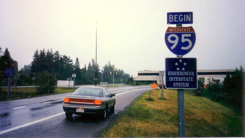
The Shield Nobody Designed
The interstate shield itself — that distinctive red, white, and blue badge shape — has an origin story that is almost comically informal given its eventual cultural weight. Early proposals for the system's route markers went through several iterations, with various shield and badge shapes under consideration.
The version that won out was selected largely because it was simple to manufacture and clearly distinct from other road markers already in use. The red and blue color scheme was patriotic by convention rather than by deliberate branding strategy. Nobody sat in a room and said, this should feel American. It just defaulted to American because the people making the decision were American, working for a federal agency, and red, white, and blue was the obvious shorthand.
What's remarkable is that this almost-accidental choice produced something with genuine staying power. The shield reads as authoritative and trustworthy in a way that many deliberately designed logos never achieve. It benefits from what designers sometimes call earned legibility — meaning that the design itself is modest, but decades of consistent application have made it unmistakable.
Standardization as Invisible Design
The 1958 publication of the American Association of State Highway Officials Route Numbering standards, and later the evolving editions of the Manual on Uniform Traffic Control Devices (MUTCD), codified what the committee had improvised. From that point on, every new interstate sign produced anywhere in the country had to conform to the established template.
That standardization is, paradoxically, what made the design iconic. A single green-and-white sign in an unusual context might be forgettable. Millions of them, stretching unbroken from the Atlantic to the Pacific, from the Canadian border to the Gulf of Mexico, create something else: a visual system so consistent that it becomes part of the landscape's grammar.
Drivers don't read interstate signs the way they read a book or a billboard. They absorb them peripherally, automatically, trusting the system to be consistent. That trust was built not by design brilliance but by bureaucratic discipline — by the unglamorous work of enforcing a standard across fifty states and sixty-plus years.
What the Signs Actually Say About America
There's something fitting about the fact that America's most recognized visual system was improvised under deadline by engineers rather than crafted by designers. It reflects something true about how a lot of American infrastructure got built: quickly, practically, under pressure, with the aesthetic dimension treated as secondary to function — and then, through sheer scale and repetition, accidentally becoming beautiful.
The green-and-white sign system is not beautiful in the way that a designed logo is beautiful. It's beautiful the way a well-worn tool is beautiful — because it works, because it's everywhere, and because after a while you can't imagine the landscape without it.
Every road trip you've ever taken was framed, mile by mile, by a design that nobody fully intended. Which means that in a very real sense, the visual memory of American travel — the green signs ticking past in the dark, the white numbers counting down to the next exit — is the legacy of a bureaucratic scramble that nobody bothered to romanticize at the time.
Somebody just needed signs. And somehow, that was enough.